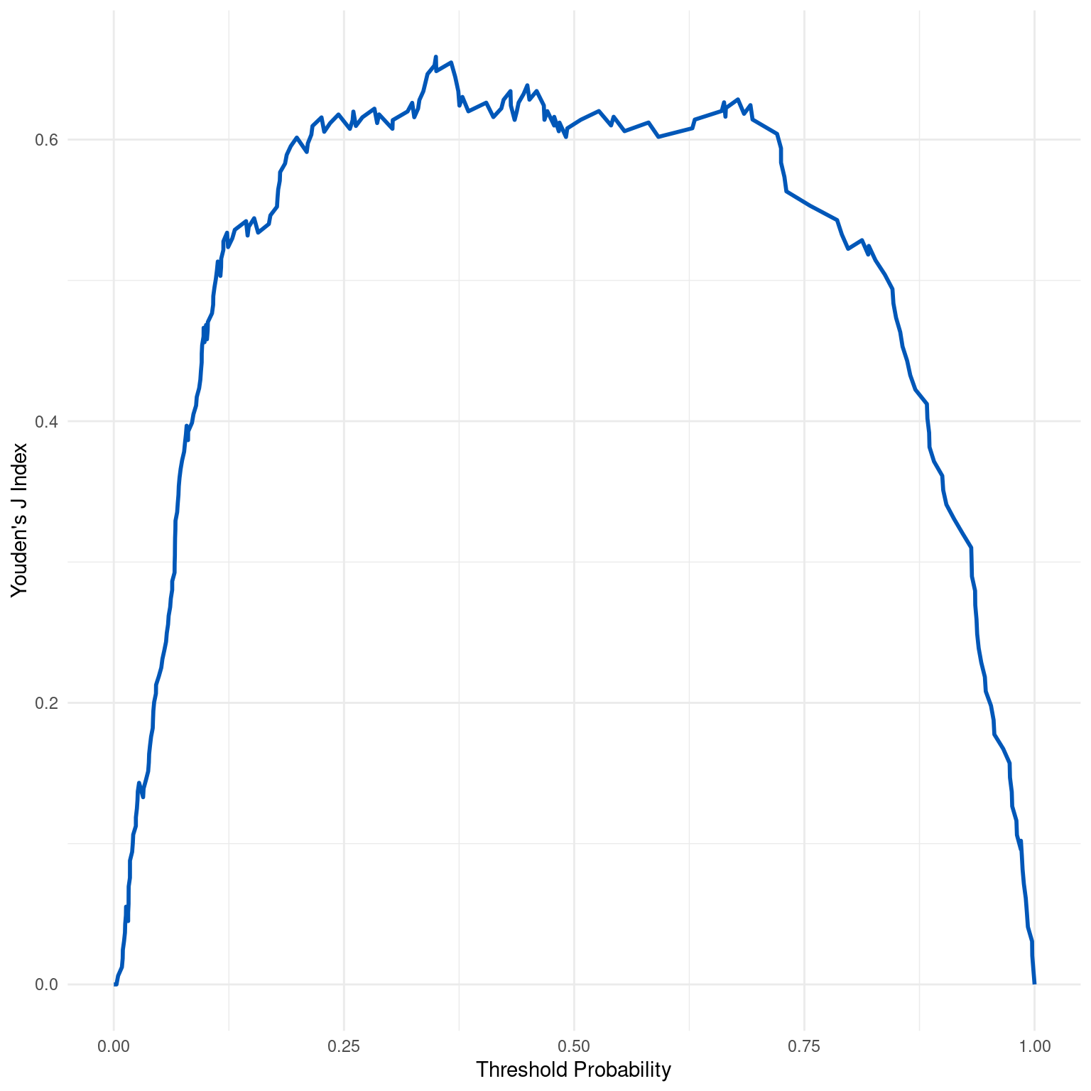
Generates a plot of Youden's J Index (Informedness) across a range of threshold probabilities for a binary classification model. The curve shows how the trade-off between sensitivity and specificity varies with the threshold.
Value
A ggplot object representing the Youden's J Index curve, which can be
further customized as needed.
Details
Youden's J Index is a summary measure of the diagnostic effectiveness of a biomarker or test, defined as the maximum vertical distance between the ROC curve and the diagonal line. It is calculated as \(J = Sensitivity + Specificity - 1\), where a higher Youden's J Index indicates a better test performance with a better trade-off between sensitivity and specificity. The index varies between -1 and 1, where 0 indicates no better performance than random guessing and 1 indicates perfect performance.
The curve plots the Youden's J Index against different threshold probabilities, enabling the visualization of how model performance (in terms of the balance between sensitivity and specificity) changes across thresholds. The peak of the curve indicates the threshold with the optimal balance between sensitivity and specificity according to the Youden's J Index.
Examples
dx_obj <- dx(
  data = dx_heart_failure,
  true_varname = "truth",
  pred_varname = "predicted",
  outcome_label = "Heart Attack",
  setthreshold = .3
)
dx_plot_youden_j(dx_obj)