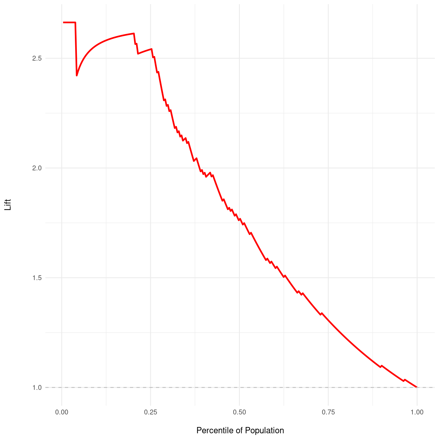
Generates a Lift chart from a dx object. Lift charts are used to evaluate the performance
of binary classification models by comparing the results of using the model versus a random
selection. The Lift chart plots the ratio of the results obtained with the model to those
obtained by a random model, across different percentiles of the population.
Details
The Lift chart visualizes how much more likely we are to capture positive instances when using the model's predictions compared to a random guess. The x-axis represents the percentile of the population when ordered by the predicted probabilities, and the y-axis represents the lift, which is calculated as the ratio of the cumulative gain at each percentile to the gain expected by chance. A value greater than 1 indicates that the model is performing better than random, with higher values representing better performance. A horizontal dashed line at y=1 represents the baseline lift of a random model. The lift curve should ideally stay above this line to indicate that the model has predictive power.
Examples
dx_obj <- dx(
  data = dx_heart_failure,
  true_varname = "truth",
  pred_varname = "predicted",
  outcome_label = "Heart Attack",
  setthreshold = .3
)
dx_plot_lift(dx_obj)