Constructs a Gain chart from a dx object. Gain charts are an evaluative tool for binary
classification models, displaying the effectiveness of the model in identifying positive instances.
Details
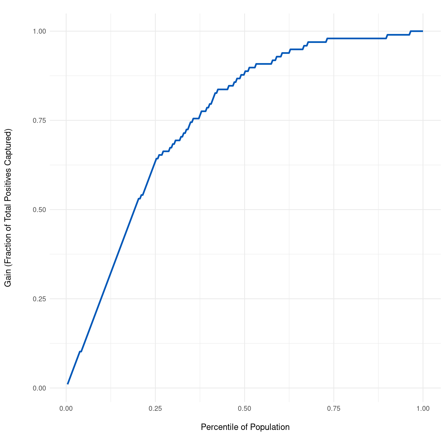
The Gain chart plots the cumulative percentage of true positive cases (gain) against the percentage of cases if evaluated by the model, ranked by the predicted probability of being positive. The x-axis represents the percentile of the population when ordered by the model's predicted probability of being positive. The y-axis represents the cumulative percentage of true positive cases found up to each percentile. The slope of the curve indicates the model's ability to prioritize positive cases over negatives. A steep curve towards the top-left indicates a model that effectively ranks positive cases higher than negatives, capturing a large proportion of positives early in the ranking. Conversely, a curve close to the diagonal suggests performance close to random chance, where the model does not effectively differentiate between positive and negative cases.
Examples
dx_obj <- dx(
  data = dx_heart_failure,
  true_varname = "truth",
  pred_varname = "predicted",
  outcome_label = "Heart Attack",
  setthreshold = .3
)
dx_plot_gain(dx_obj)