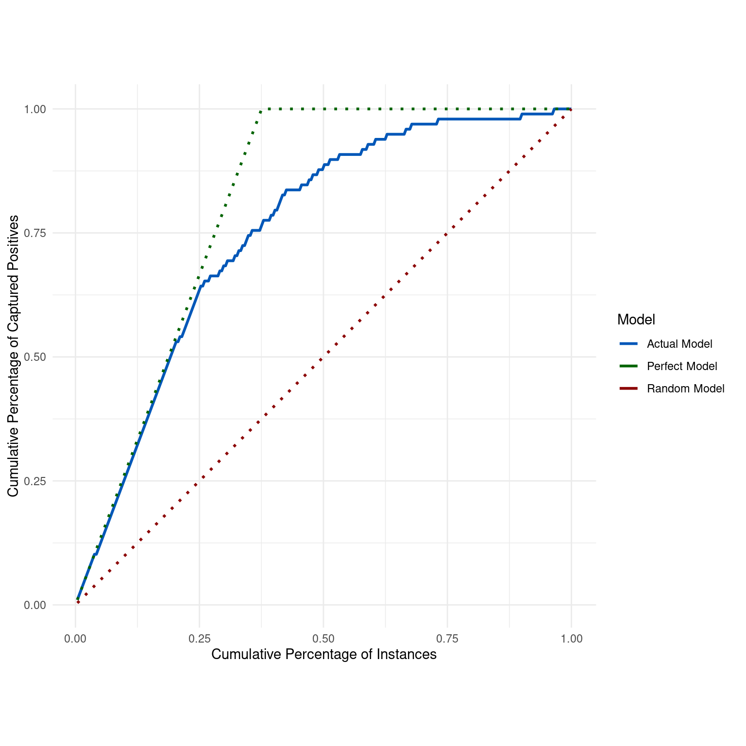
Generates a Cumulative Accuracy Profile (CAP) Curve to evaluate and visualize the performance of a binary classification model by comparing its cumulative accuracy against that of perfect and random models.
Value
A ggplot object representing the CAP Curve with actual, perfect, and random
model lines, allowing for further customization if desired.
Details
The CAP Curve provides a visual representation of the effectiveness of a binary classification model in ranking positive instances compared to two baseline strategies: a perfect model that captures all positives immediately and a random model that captures positives uniformly at random. The curve illustrates the cumulative percentage of captured positives (Y-axis) as a function of the cumulative percentage of instances (X-axis).
The function plots three lines:
Actual Model: Represents the cumulative accuracy of the given model.
Perfect Model: Represents the hypothetical scenario where all positive instances are ranked before any negative instances.
Random Model: Represents the baseline scenario of randomly guessing the class.
The CAP Curve is useful for understanding not just the accuracy but also the behavior of the model across the entire range of classifications. It's particularly insightful for imbalanced datasets where positive instances are rare or more critical.
Examples
dx_obj <- dx(
  data = dx_heart_failure,
  true_varname = "truth",
  pred_varname = "predicted",
  outcome_label = "Heart Attack",
  setthreshold = .3
)
dx_plot_cap(dx_obj)

