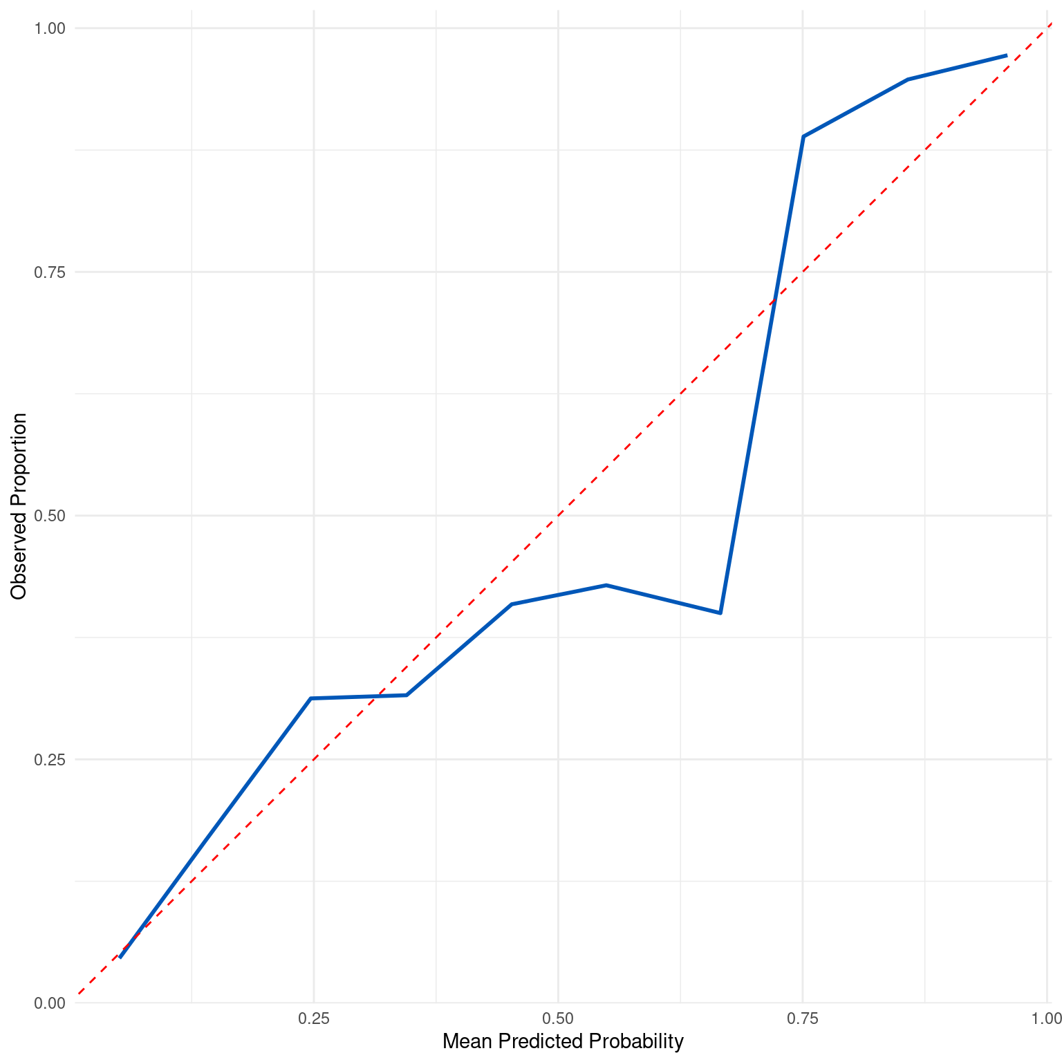
Generates a calibration plot to assess the calibration of predicted probabilities against observed outcomes. The function plots the mean predicted probability against the observed proportion of positive outcomes for different bins of predicted probabilities.
Value
A ggplot object representing the calibration curve, which can be further customized as needed.
Details
The calibration curve is an important diagnostic tool to understand how well a model's predicted probabilities
match the observed frequencies of the outcomes. A well-calibrated model will have a calibration curve that closely
follows the diagonal line y = x, indicating that the predicted probabilities are reflective of the true likelihood
of the event. The curve is constructed by dividing the predicted probabilities into bins number of bins and then
plotting the average predicted probability against the observed proportion of positive outcomes in each bin.
The number of bins can be adjusted to change the granularity of the calibration curve.
A calibration curve that deviates significantly from the diagonal line indicates that the model may be under or overestimating the probabilities. In such cases, calibration methods like isotonic regression or Platt scaling might be applied to adjust the model's predicted probabilities.
Examples
dx_obj <- dx(
  data = dx_heart_failure,
  true_varname = "truth",
  pred_varname = "predicted",
  outcome_label = "Heart Attack",
  setthreshold = .3
)
dx_plot_calibration(dx_obj)

